Typography plays a significant role in our daily lives, influencing the way we communicate and interact with the world around us.

As a result, choosing the right font is essential to effectively convey a message, set the tone, and create a lasting impression.

With so many fonts available today, it can be challenging to know which one to choose. In this article, we will highlight five of the most eye-catching and versatile fonts of the week, providing you with the information you need to make an informed decision and take your typography to the next level. From modern and sleek to classic and elegant, these fonts are sure to add a touch of sophistication and flair to your next project.

Baskerville is a serif typeface that was designed by John Baskerville in the mid-18th century in England. It is known for its elegant and classic appearance, which makes it a popular choice for books, magazines, and other printed materials. Baskerville’s letterforms are characterized by their sharp, clean lines and strong contrast between thick and thin strokes, giving the font a sense of refinement and sophistication. The serifs, or small decorative flourishes at the end of each letter, are also relatively sharp and distinct, adding to the font’s overall elegance. The Baskerville typeface is often described as having a timeless quality, making it a popular choice for both traditional and modern designs. It is commonly used in body text for printed materials such as books, magazines, and newspapers, as well as in logo design and branding. Overall, Baskerville is a classic and elegant serif typeface that is both legible and versatile, making it a popular choice for a wide range of design projects.

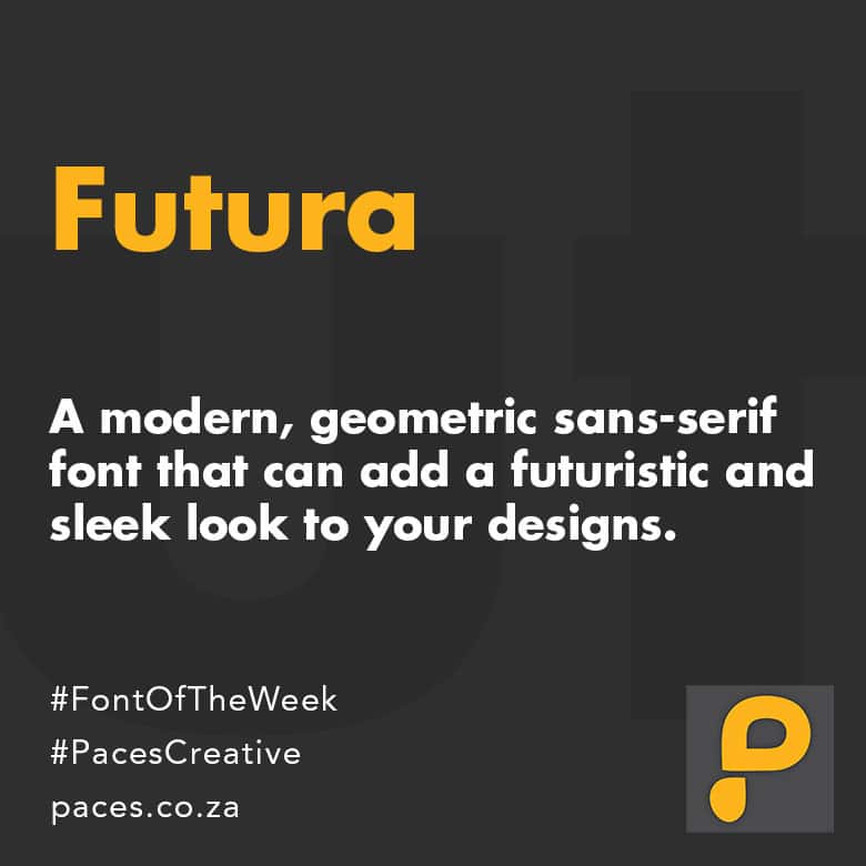
Futura is a geometric sans-serif typeface designed by Paul Renner in 1927. It is characterized by its simple and clean lines, with circular forms and distinct geometric shapes. The design is based on simple geometric shapes, such as circles, triangles, and rectangles, and is often described as modern and futuristic.

Futura has a large x-height, which means that the lowercase letters are relatively large compared to the uppercase letters. The letters are also quite wide, giving the typeface a solid and stable appearance. Futura has no serifs, and the terminals of the letters are usually flat, which gives the typeface a very clean and modern look.

Futura is available in various weights, from light to bold, and is often used for headlines, logos, and branding. It has been widely used in graphic design, advertising, and architecture, and has become one of the most iconic typefaces of the 20th century.

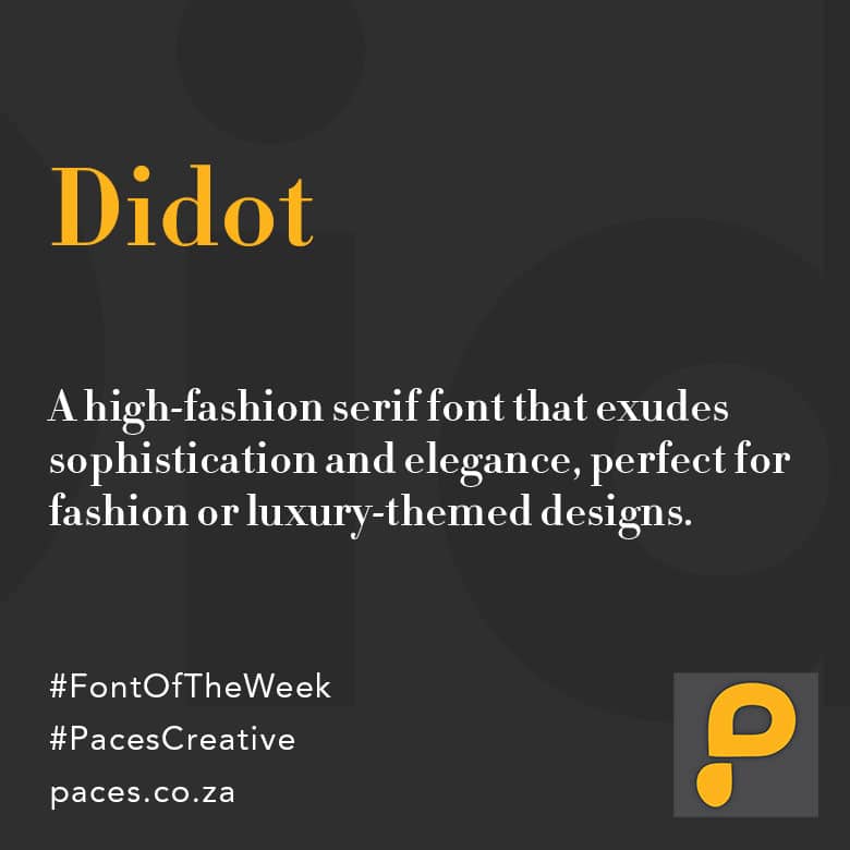
Didot is a serif font that was created by French typographer Firmin Didot in the late 18th century. It is a classic, elegant typeface that is known for its thin and delicate strokes, high contrast between thick and thin lines, and vertical stress.

The Didot font family includes several weights, from light to bold, and is characterized by its modern, geometric design. The font features long thin serifs, high contrast, and a vertical stress that is achieved through the use of vertical hairlines and large x-heights.

Didot has been widely used in fashion magazines, luxury brand logos, and high-end design projects due to its clean, sophisticated look. It has also been used in editorial design, advertising, and branding applications, and is often paired with sans-serif fonts for contrast and emphasis.

Garamond is a serif typeface designed by French type designer Claude Garamond in the 16th century. It is a classic and elegant font that is often used in printed materials, such as books, magazines, and newspapers. The font is characterized by its graceful, flowing curves and its relatively small x-height, which refers to the height of the lowercase letters relative to the uppercase letters. Garamond has a classic and timeless look, which makes it a popular choice for book typography. There are several variations of the Garamond font, including Adobe Garamond, ITC Garamond, and Stempel Garamond, each with their own subtle differences in style and character. Overall, Garamond is a highly legible and versatile typeface that is well-suited for a wide range of design applications.
Montserrat is a geometric sans-serif typeface designed by Argentinian designer Julieta Ulanovsky in 2010. The font was inspired by the urban typography of the Montserrat neighborhood in Buenos Aires, which gave the typeface its name. Montserrat has a clean and modern look, with uniform stroke widths and geometric shapes. It features uppercase letters with a slightly condensed appearance and rounded edges, while lowercase letters are more open and spacious. The font is highly legible and versatile, making it suitable for a wide range of design applications, including print, web, and mobile interfaces. Montserrat comes in multiple weights, including Thin, Extra Light, Light, Regular, Medium, Semi-Bold, Bold, Extra-Bold, and Black, providing designers with a variety of options for their projects. The font is available for free under the SIL Open Font License, making it a popular choice among designers and developers.