In this week’s font blog post, we’ll be diving into the top 5 webfonts of the week as curated by our expert designers.
As you may know, webfonts play a crucial role in the overall user experience of a website. They can make or break the readability and legibility of your content, which in turn affects your site’s overall credibility and appeal. With so many webfonts available today, it can be overwhelming to choose the right one for your website.
That’s where Paces Creative comes in. Our designers have scoured the web to bring you the top 5 webfonts of the week that not only look great but also offer excellent functionality and readability. From classic serifs to modern sans-serifs, we’ve got you covered.
In this article, we’ll be showcasing each of the top 5 webfonts of the week, discussing their unique features and why they made our list. We’ll also provide examples of websites that use each font effectively to give you inspiration for your own projects.
So whether you’re a seasoned designer or just starting out, read on to discover the top 5 webfonts of the week according to Paces Creative.
Open Sans
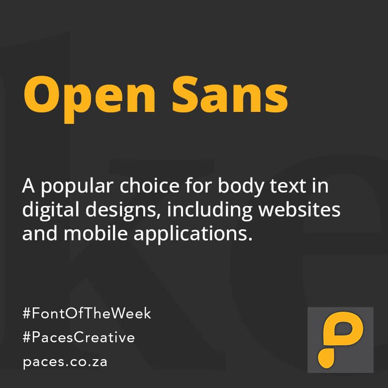
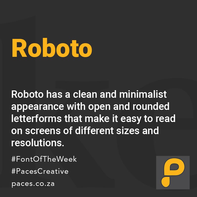
Open Sans is a popular typeface designed by Steve Matteson, a typeface designer from Ascender Corp. It is a humanist sans-serif typeface, which means it is designed to have characteristics similar to handwriting or calligraphy.
Open Sans was first released in 2011 and has since become a widely used typeface, particularly in digital design. It is an open-source font, which means it can be used for free and is available for anyone to modify and distribute.
The typeface features a clean, modern look with a wide range of weights and styles, including light, regular, semibold, bold, extrabold, and black. It also includes both regular and italic styles for each weight.
One of the defining features of Open Sans is its legibility, particularly at smaller sizes. This makes it a popular choice for body text in digital designs, including websites and mobile applications. It has also been used in print designs such as logos, advertisements, and posters.
Overall, Open Sans is a versatile and reliable typeface that is well-suited for a variety of design projects.
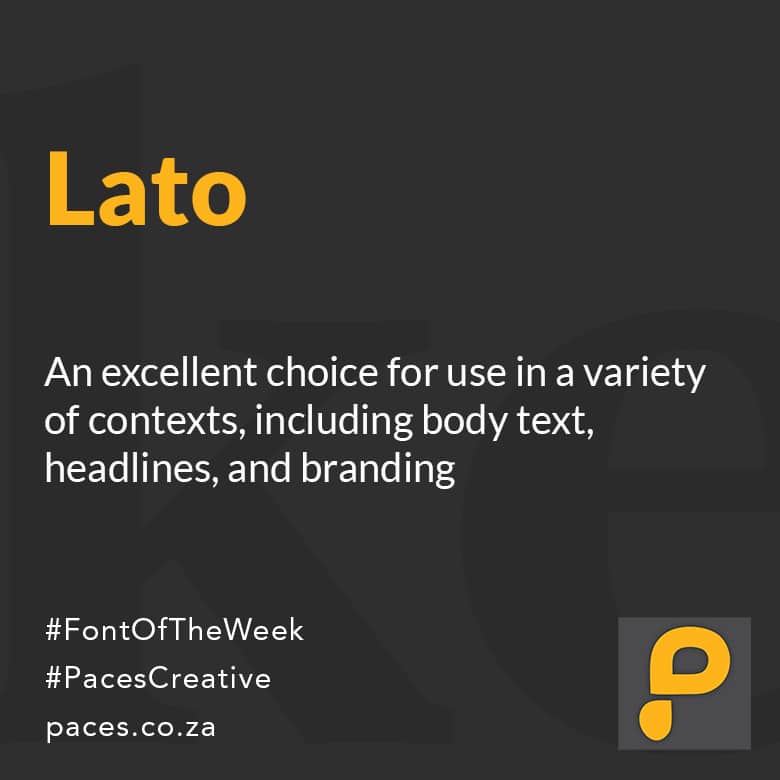
Lato is a sans-serif typeface designed by Łukasz Dziedzic in 2010. The font was commissioned by the Warsaw-based tyPoland, a studio that specializes in designing high-quality typefaces.
Lato is a humanist sans-serif typeface, meaning that it has some characteristics of traditional serif fonts, such as varying stroke widths and a slight angle on some of the letterforms. The font is available in ten different weights, ranging from hairline to black, and includes true italics for each weight. Lato has a large x-height, which means that the lowercase letters are relatively tall compared to the capitals, making it easier to read in smaller sizes.
The overall design of Lato is modern and clean, with open apertures, large counters, and minimal stroke contrast. It is an excellent choice for use in a variety of contexts, including body text, headlines, and branding. Lato has been widely used in digital and print media since its release and is considered a versatile and reliable choice for designers and typographers alike.
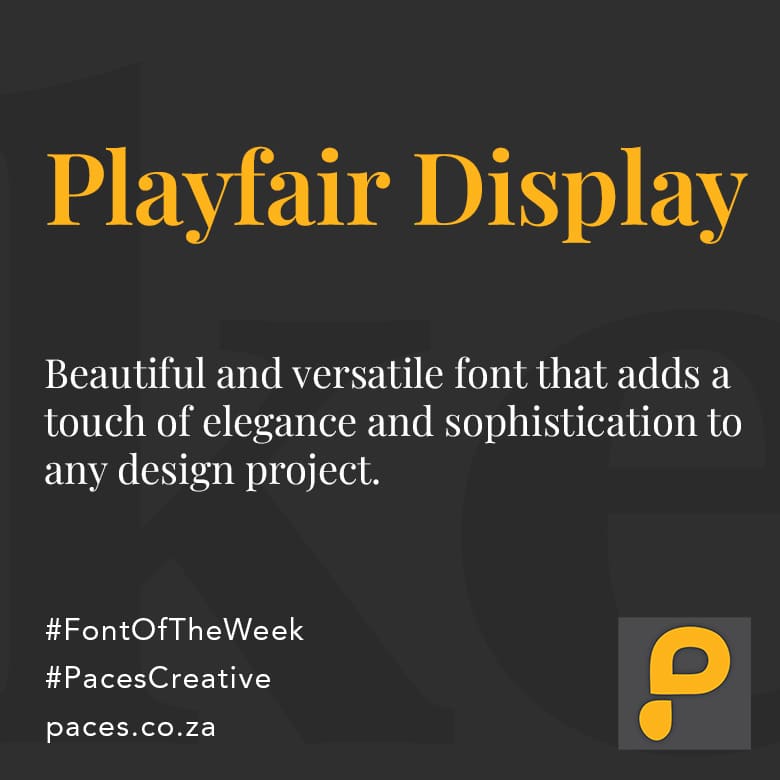
Playfair Display is a serif typeface designed by Claus Eggers Sørensen in 2011. The font was inspired by the letterforms of the 18th-century typeface Baskerville and is characterized by its elegant, high-contrast letterforms and generous spacing.
The font features tall, thin lowercase letters with elongated ascenders and descenders, which gives it a classical and refined appearance. The uppercase letters are slightly more condensed, with elegant serifs that lend an air of sophistication to the typeface.
The font also features a range of ligatures, which are special characters that combine two or more letters into a single glyph for a more harmonious look. Playfair Display is available in a range of weights, from light to black, making it a versatile typeface for a wide range of design applications, from headlines to body text.
Overall, Playfair Display is a beautiful and versatile font that adds a touch of elegance and sophistication to any design project.
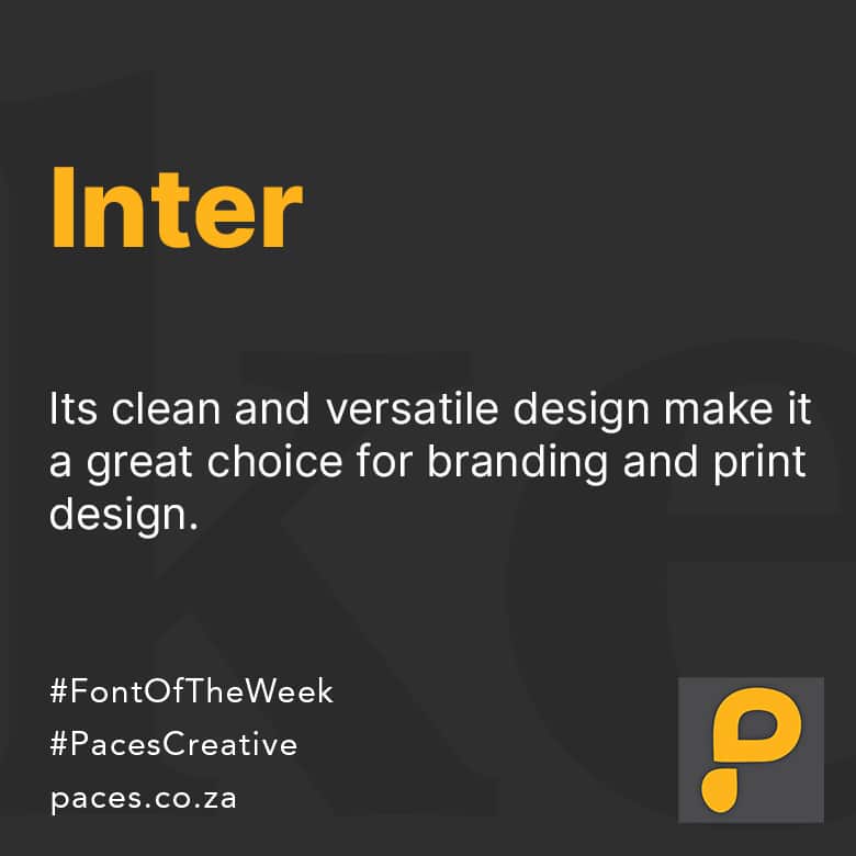
Inter Font is a typeface designed by Rasmus Andersson, and it is a modern sans-serif font that is easy to read on screens and in print. The font is available in several weights and styles, making it suitable for a wide range of design projects.
The Inter Font family was designed to be highly legible and versatile, making it an ideal choice for UI/UX design, web design, branding, and other graphic design applications. It has a clean, geometric design with open letterforms, making it easy to read at both small and large sizes.
The font is also designed to be highly accessible, with features such as open counters, large x-height, and clear differentiation between uppercase and lowercase letters. It supports a wide range of languages and writing systems, including Latin, Cyrillic, and Greek, and comes with a range of glyphs and symbols.
Overall, Inter Font is a versatile, modern, and highly legible typeface that is suitable for a wide range of design projects. Its accessibility features make it an excellent choice for web and mobile design, while its clean and versatile design make it a great choice for branding and print design.